
Playbook
Playbook is a gamified learning experience designed to make sports more accessible and fun to understand. Inspired by platforms like Duolingo, Playbook breaks down complex rules, leagues, and gameplay into bite-sized, interactive lessons—helping users build confidence, curiosity, and a deeper appreciation for the world of sports.

The Basics
PROJECT TYPE: Responsive mobile app, design system, & brand design
ROLE: Sole UX/UI designer & brand designer
INDUSTRY: Sports, Education/EdTech
TOOLS: Figma, Adobe Illustrator, Adobe Photoshop, Adobe Premier
DURATION: January 2025 - May 2025
Tackling the Challenge
Sports are a huge part of culture and conversation, but there’s no easy, welcoming way for newcomers to learn the basics—without judgment, jargon, or hours of research.
Leveling the Playing Field
Playbook is the first mobile learning app that makes understanding sports leagues, terminology, rules, and culture feel like playing a game. Designed to be accessible, approachable, and always at your fingertips, Playbook delivers quick, gamified lessons that make learning about sports as fun as watching, or even playing them.
In just five minutes a day, users can go from confused to confident, ready not just to join the conversation, but lead it.
Building the Brand
Visual Identity

Logos
Playbook’s brand is anchored by two logo marks: a primary logo for clean brand recognition, and a versatile monogram symbol built for instant recognition across digital spaces.

Typography
Typography strikes a balance between strength and friendliness. Sporty Pro Black delivers bold impact for headlines and key moments, while Dongle adds a modern, rounded tone, designed for comfort and clarity on mobile screens.

Primary Color Palette
Playbook’s visual design is bold, energetic, and approachable—capturing the spirit of sports while staying accessible to newcomers. The primary color palette pairs Dynasty Blue, evoking strategy and authority, with Power Play Orange, a vibrant nod to the energy and excitement of the game. Neutral tones like Iron Grit and Playmaker Pearl provide balance, ensuring clarity and accessibility throughout the experience.

Secondary Color Palette
A secondary palette adds contrast and dynamism to gameplay moments, enhancing engagement and readability within the app.
Applying the Playbook Brand
Playbook is more than just an app. It’s a brand designed to live wherever fandom does. From exclusive merch drops and strategic partnerships with teams and leagues to live community challenges, Playbook extends beyond the screen to build real-world connection and momentum.
Whether you're on the field, in the stands, or learning the ropes from your phone, Playbook transforms learning into a lifestyle fueled by energy, community, and a love for the game.


Marketing in Action
Developing the Product
Design Tokens
To create a scalable and consistent visual system, I established a set of design tokens that defined Playbook’s core styles. These included color values, typography rules, spacing units, and interaction states. This foundation ensured visual consistency across screens and made it easier to maintain and evolve the UI as the product grew.
Wireframes
I developed both low and high-fidelity wireframes to shape the structure and flow of Playbook’s core features. Low-fidelity wireframes allowed for quick iteration and feedback on layout and navigation, while high-fidelity wireframes brought in visual style, branding, and interaction details. Together, they helped align the design vision with usability and product goals.


How Playbook Works

Learn Anywhere
Playbook is built for flexibility—designed to fit into any schedule, so users can brush up on sports knowledge anytime, anywhere.
Quick Lessons
Bite-sized lessons make it easy to learn at your own pace, turning complex sports concepts into approachable, everyday knowledge in just a few minutes.
Motivational Rewards
Streaks, badges, and progress tracking provide positive reinforcement, helping users stay motivated and celebrate their growth.
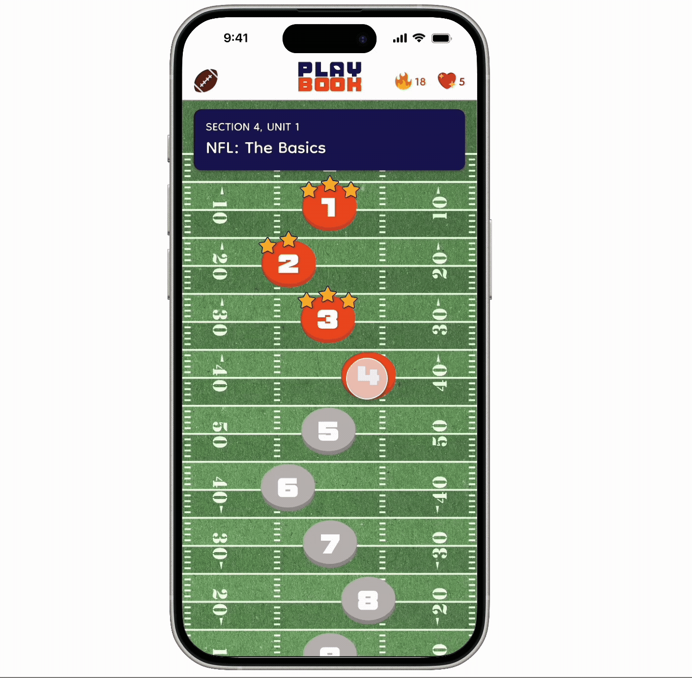
Interactive Quizzes
Each lesson ends with a quiz designed to reinforce learning through play, keeping users engaged while building confidence along the way.
Post-Game Analysis
Working on Playbook taught me the power of accessibility, not just in design but in culture. I gained a deeper understanding of how thoughtful, inclusive UX can break down barriers to entry and open doors to new communities. Sports can often feel like an insider language, but through this project, I saw how design can demystify and democratize that experience.
This project pushed me to think strategically about how to combine education with entertainment, and how to design for both clarity and joy. I learned how small, intentional design choices like approachable language, rewarding interactions, and visual consistency can build trust and confidence in users. Most of all, I saw how design can foster a sense of belonging by giving people the tools they need to participate, connect, and feel welcome.